Dragon Pilots has artistic issues
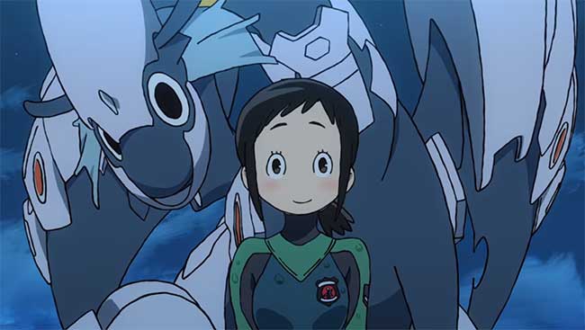
Anime as a medium encompasses many unique drawing styles. As such it is not rare to occasionally see a series that looks different. Most of the time a unique art style serves to differentiate a series from its peers, at times even adding a completely new layer of complexity and sophistication. A good example would be Lucky Star, an adult-oriented show that intentionally employs a moe art style for the sake of satirizing said style (and the overall otaku movement that existed at the time). This year’s Hisone & Masotan (Dragon Pilots) also features a distinct art style. Sadly however, this is one anime in which the art style gets in the way of the show, preventing it from reaching its true potential. Since the misuse of art in anime is quite a rare occurrence I thought it would be a good idea to analyses this show to better understand how this design choice came to be used and why it has inadvertently become the shows Achilles’ heel.
Hisone & Masotan character designs were drawn by mangaka Aoki Toshinao in his signature sketchy art style. In an interview conducted prior to the series airing executive director Higuchi Shinji explained why Aoki’s design were chose to serve as the backbone for the anime. At the time Higuchi said, “Aoki san’s characters and appeal will look great in modern animation. It will look fresh. It will look pure.“
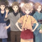
And without a doubt Dragon Pilots looks very out of the ordinary, to a fault. The biggest and most immediate issue one will encounter when watching the series is that it is impossible to discern the age of the characters. Aoki’s art style simply does not allow for a clear distinction of age. As a result it took me quite some time to discern that Hisone (the shows main character) is in fact an adult. Things become even more confusing when the other dragon pilots appear. All of them, with the exception of Morris, act like children, and yet are depicted with similar proportions to Hisone and are expected to form romantic relationships in an adult-filled airbase.
Another issue can be found in the direction of the series, and how it eventually limits the effectiveness of the art. According to its Japanese Wikipedia page Hisone & Masotan was supposed to be a comedy, but upon watching the entire series it is clear that in the second half of the series the focus shifted towards a more action-oriented drama with military elements à la Strike Witches. This shift in focus is something the sketchy character designs simply cannot handle. Aoki’s unique art style does wonders when utilized in a parody-styled manga and shines the most in the comedic portions of the show. But it proves to be too simplistic to convincingly convey deep emotions such as sorrow, sadness and jealousy. So when the show tries to add this second layer of complexity it undermines its own base, spiraling out of artistic control.
This is where I would like to note that Hisone & Masotan is not the only anime series that limited itself due to its art style. Attack on Titan, one of the most successful shows in recent years, has also suffered from the inability to convincingly show certain emotions due to the constantly horror-stricken faces all of its characters share. However, Attack on Titan manages to escape criticism because at its core it is a horror action show, and the art style it uses conveys horror very convincingly. It is here that Dragon Pilots falters. In its second half it becomes a drama drawn as a parody, a serious story depicted jokingly. This fact greatly hinders the entire show on multiple levels. The design directly hurts the story. And to be perfectly honest, the story also hurts the art style. One could make the argument that if Aoki’s art was used for a purely comedic show it could have become a cultural phenomenon. Instead it was implemented incorrectly, resulting in an interesting, albeit very much flawed, show.


 I’m a big fan of Ghost in the Shell and the intellectual stimulus it injects into the anime world. The… ∞
 Any contemporary anime viewer has, to some extent, been exposed to moe in one form or the other. Moe can… ∞
 In 2012 we were graced with a unique short film called Death Billiards, which aired as part of the Young… ∞
 The 2014 autumn anime season had a few excellent shows with high production values. It also had a considerable amount of low profile shows… ∞
 I was pleasantly surprised to find out that Hanasaku Iroha: Home Sweet Home is not about the Kissuoiso. Unlike the… ∞
 The 2014 autumn anime season is one of the strongest, most robust, anime seasons in memory. As a result the offerings this… ∞
 Good Smile Company's Nendoroid figure line has been with us for some years now. It had its fair share of… ∞
 The fall 2014 anime season is here and its time to catch up on what's new and hot. So we've… ∞


 Modern times have the tendency to crush us under the burden of work and expectations. I myself am only two months away from moving to another country and opening my… ∞